"I have been a witness, and these pictures are my testimony. The events I have recorded should not be forgotten and must not be repeated." - James Nachtwey

Thursday, 1 April 2010

Project Evaluation

Overall, I really enjoyed this project. It was very open and it was fun to see everyone's individual work as well as taking inspiration from each other. I found some new photographers such as Alfred Stieglitz who I really admire now and I would like to try some more cloudscapes on film. My favourite thing about this project is the freedom and I quite enjoyed not having a workbook to worry about. If I did it again I would experiment more with portraiture and possibly do more than one film. 
My favourite image is still one from the first week;


Week 6 Evaluation

Although my images were no where near as successful as Alfred Stieglitz's, I think I did pretty well. Stieglitz's images are much higher contrast and have more range in the tones. I could have achieved this by using an orange, or possibly red filter but I was sadly unable to get hold of one.

Alfred Stieglitz
This series of images was named "Equivalents" and ranged from 1925 - 1934. Stieglitz is highly reguarded to be one of the first photographers to escape from images always having a direct meaning and the images are very abstract for the time period. The series contained about 220 images and it is rare for any of these to feature common aspects of cloudscapes such as horizons and trees although towards the end of the series he did do a set involvng trees.

Week 6 - Taking after Alfred Stieglitz

As I had planned at the start of the project, my film week is studying clouds. This is something I do a lot on digital and after seeing Alfred Stieglitz's work I really wanted to do a fim study on film. With the awful weather and the fact the whole of England has been covered by one huge, unsightly storm cloud, I had to wait for a nice day and was very close to resorting to my back-up plan. Thankfully, the bad weather passed and I managed to get the following Stieglitz-inspired images.
Taken: 29th March, 2010
Edited: N/A
Camera used : Nikon F50


My first cloud image, This one is quite dark in general but I love all the contrast and how the sun is breaking through the clouds in the top right corner. There is a great variation of fluffy, soft clouds and thick, dense clouds.

Taken: 29th March, 2010
Edited: N/A
Camera used : Nikon F50


This is an interesting image in the way the clouds are parted in three places. There is less sunlight in this but more contrast.

Taken: 29th March, 2010
Edited: N/A
Camera used : Nikon F50


This is by far my favourite from the set. With the sunlight very bright to the right, the light gradually fades out until there are very deep, grey clouds to the left. Out of all the images this one has the best variation in tone.

During this photoshoot I also wanted to do some Alfred Stieglitz with a modern twist by adding some man-made structures. This is again, something I love to do with digital.


Taken: 29th March, 2010
Edited: N/A
Camera used : Nikon F50


The phone mast is very central and dark giving a good focal point to the image. I also took a similar image with the phone mast off to the left to go by the rule of thirds but decided I like it more when it is central.


On the way home from my photoshoot I was walking down an ally I walk down everyday and have often photographed with little success. I thought to myself, maybe it will look better on film, so I gave it a go and I really like the results.

Taken: 29th March, 2010
Edited: N/A
Camera used : Nikon F50


Taken: 29th March, 2010
Edited: N/A
Camera used : Nikon F50


The area looks very run down with strange angles and tilted buildings.

Week 5 Evaluation

I wasn't hugely keen on this set when I first saw them but they have grown on me. My idea to stick to famous brands came from the infamous Andy Warhol, in particular his very famous Campbell's Soup image from 1968.  I searched high a low for a can like this but just when I need one, I can't find it.

The idea of using repetition also came from Warhol's work. This image below of Marilyn Monroe made me want to keep the black marks in the images which I originaly wasn't keen on.

To start with I was tempted to re-shoot for week 5 but after more research I grew to like my own images and now I am quite please with them.

Week 5 - Popart

This weeks images were very experimental and I wasn't sure how they would come out. Overall I am reasonable pleased with the images although I think I could have done better. These images were made by taking a photo in my macro light box and then heavily editing them by putting the contrast up high and adding effects.
Taken: 28th March, 2010
Edited: 28th Marth, 2010
Camera used : FinePix S5800


My favourite from the week, when I was researching I noticed many popartists use repitition in their images and I did this by simply copy and pasting the original (The left image) and changing the colours each time.
 This Marmite jar was a limited edition version for Valentine's Day a few years ago. My Mum has collected Marmite merchendise for years so there was no shortage of options here.


Taken: 28th March, 2010
Edited: 28th Marth, 2010
Camera used : FinePix S5800


I carried on the repitition with this image. Again, a well known brand, which is often used in Popart. The three tins were photographed seperatly and then stacked together. The images didn't really change much when edited, possibly due to the fact they are already very graphic and bold. 


Taken: 28th March, 2010
Edited: 28th Marth, 2010
Camera used : FinePix S5800

Yet another well known brand which I put through the same editing and photographic processes to make.
Taken: 28th March, 2010
Edited: 28th Marth, 2010
Camera used : FinePix S5800

Yet again carrying on with the brand theme. Like the syrup set, this design didn't change much, again I can guess this is due to how graphic the design already is.
Taken: 28th March, 2010
Edited: 28th Marth, 2010
Camera used : FinePix S5800

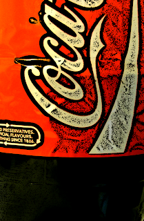
The last in the set and of course, sticking with famous brands. Cola is an extrmely common subject amongst popartists so this was a must-hand in the set.

Week Four Evaluation

I am extremely pleased with this weeks images and I think overall they are a very successful set of images. The original idea was not to make them look scary but I really like this quality they have. The most scary aspect of it for me was going back to something I'd spent much of my childhood building and collecting for. Back then the whole dolls house was very sweet and innocent, now it has that eerie aspect from the images which somehow sap all the innocence out of it. One way I'd have loved to imposve these is by using a proper macro lens rather than a simple macro setting on my camera.

Inspiration
My inspiration for this week was a photographer called Matthew Albanese who I saw on The Sun website with his Mother Nature series.

"My work involves the construction of small-scale meticulously detailed models using various materials and objects to create emotive landscapes. Every aspect from the construction to the lighting of the final model is painstakingly pre-planned using methods which force the viewers perspective when photographed from a specific angle. Using a mixture of photographic techniques such as scale, depth of field, white balance and lighting I am able to drastically alter the appearance of my materials. "

Below are some examples of Albanese' work.


This shows how Albanese creates his work. He simply makes a little world or surrounding to create these wonderful images.
"Made out of tile grout, cotton, phosphorous ink. This model volcano was illuminated from within by 6-60 watt light bulbs."


Another example of Albanese making his work.

"Fields, After the Storm. This model is simply made out of faux fur(fields), cotton (clouds) and sifted tile grout(mountains). The perspective is forced as in all of my images, and the lighting effect was created by simply shifting the white balance."

Sugarland, Made out of 20 pounds of sugar, jello and corn syrup. The crystals were grown in my studio over the course of two months.


Aurora Borealis. This one was made by photographing a beam of colored light against a black curtain to achieve the edge effect. The trees were composited from life ( so far the only real life element in any of these images) The stars are simply strobe light through holes in cork board.

Tornado made of steel wool, cotton, ground parsley and moss

This one is a mixture of many different materials, tile grout, moss, bottle brushes (pine trees) Actual clippings from ground cover and was built on top of standard outdoor patio table (water glass). The sky is canvas painted blue. Coloring was again achieved by shifting white balance.

This is the one which gave me the dolls house idea, although I didn't want to set fire to my childhood. Burning Room, Made of wood, nylon, plexiglass, purchased dollhouse furniture. The model was actually set on fire to achieve this effect.

Week Four - Minaiture Madness

For this week, I cracked open my old dolls house I had as a kid which sadly got ruined. I had originaly planned to keep the images colour but I changed them to black and white as an experiment and was happy with the results. The images look very eerie.


Taken: 29th March, 2010
Edited: 29th Marth, 2010
Camera used: FinePix S5800

My first in this series of images. What I really love about this image is the contrast between the chair and the rest of the image.  The depth of field really helps the chair stand out. All the detail in the little dolls house furniture really makes the images.

This is by far the scariest from the series. While editing this one I put the contrast up to create more of an atmosphere in the image. This was taken in a hallway of the dolls house. The halls are very narrow which made the photograph frame itself with the walls which makes the whole area feel more closed in a chlaustraphobic, adding yet more to the atmosphere.

Taken: 29th March, 2010
Edited: 29th Marth, 2010
Camera used: FinePix S5800

My favourite thing about this image is the shadows. While buying the furniture for this room a long time ago, I remember choosing the fireplace due to the fact it's very similar to the one we have in our lounge at home. I had never realised until I had finished editing the image that there is the shadow of the woman in the dolls house over the fireplace. This made me want to go back and take one just of her shadow.

Taken: 29th March, 2010
Edited: 29th Marth, 2010
Camera used: FinePix S5800

This is the aforementioned image of the woman's shadow. I thought it would look better than it does but overall I am pleased with it. The way the image is positioned looks like it's a bust when infact it was a whole doll of a woman.

This is one I really like from the shoot. I'd probably say this is the most successful in the way that it is the closest to looking like a real room. Again, I feel what really makes this image is the shadows and contrast. The image has graduated tones from the left to right, starting very dark with many shadows to a simple blank wall to the right.

Taken: 29th March, 2010
Edited: 29th Marth, 2010
Camera used: FinePix S5800


Last but not least, this is the outside of dolls house. You can see from here how damaged the dolls house is with the missing door, damaged windows and ruined paintwork. I love the lighting in this image but I don't feel it looks very realistic.

Tuesday, 30 March 2010

Greg White

As aforementioned, I wanted to go into greater detail about Greg White. I find him to be extremely influential and I never stop looking at his images and continuously being influenced. Although not a well known name, his advertising work is widely seen throughout magazines.

Below are some examples of his advertisements. I remember thinking these were great images the first time I saw them, with no idea who the work was by. His advertising work seems to centre around spot and cars. The companies range from Nike and Adidas and Audi to Lexus. Of course he does not limit himself to these areas.  He was also the photographer on the quite amazing and colourful Sony Bravia advert.

Sony


Lexus

This example for a Nissan advert is, in my opinion, an amazing example of photomanipulation.


I am quite fascinated by his series of 'Behind-the-Scenes' images. This again links into advertising as almost all of these images are from advert filming. I posted a number of these in a past evaluation so I wont go into great detail about them here. Below is a number of examples.

Although White is a fantastic advertiser and graphic designer, it's his architecture and factory work which really fascinates me. The factory photoshoots could be more 'behind-the-scenes' from advert shoots but I can't be sure on this. 

What I find amazing about his architecture work is the modern and very man-made feel to all the buildings he photographs. Lots of these images use clean whites and silvers and are very simplistic.


...and again, as posted before in my previous evaluation, this is by far my favourite image by any photographer I have come across and I find it simply fascinating in every meaning of the word. I could sit staring at this image for days, continuously finding new things.

Drum-roll please...


Malcolm Glover


Malcolm Glover is a great example of an artist working with Stitching joiners. Stitching is an amazing way to represent panoramic shots of an area.


His images are often packed with action, hinting that the image was not quick snapshots but a carefully planned series of images creating a scene full of life. All together the image took 6 hours to shoot.


This image above was shot by taking one frame every 45 minutes. From left to right the weather changes and the scene gradually gets darker. Unlike the above example in the swimming pool, this one is less action-pact and focuses more on colour. This image shows 'hidden life' within the street.

Malcolm Glover has recently exhibited at the Hastings Museum and Art Gallery and has made a series of work on Allotment Holders, which will shortly be published in book form and can be ordered from the gallery.

David Hockney


Our lesson about Joiners is the first time I have come across David Hockney's work but I find it very interesting. Hockney's experimentation with photocollage began in 1982. He has commonly been linked to Cubism due to his images having qualities that a single photograph cannot have, this links him to Picasso, who Hockney takes heavy influence from.

"Television is becoming a collage - there are so many channels that you move through them making a collage yourself. In that sense, everyone sees something a bit different. 
 - David Hockney

Unlike many examples of Joiners I find, this one is unique (although it has been done before) in the way each single image used is a traditional rectangle shape, many others use square polaroid images. I really love the way the bottom of the image is very jagged compared to the other edges. I personally thing the most interesting thing about this is the fact it almost looks like a sketch in places, especially the cars. As I mentioned in my example of a montage, the building edges do not line up and the image as a whole is very abstract.


Thursday, 18 March 2010

Joiners


A joiner is a type of photomontage where a number of separate images are used to create one image. There are a few types such as montage and stitching. More comprehensive joiners can use 50 or maybe even more images to create a large the single joiner.


This is an example of how a series of photographs can be put together to create one montage. The image looks very out of line creating an abstract feel. I believe this type of joiner works very well with man-made objects and structures such as this example of the college building.


This is my example of stitching.  To make this I took a tripod into the college car park and took a series of images simply moving the tripod around slightly each time. I found this to be a big challenge but I am very pleased with the overall result. Stitching creates a much less abstract image than a montage, this is done by using tools such as the eraser on Photoshop to bled the images together.

Monday, 15 March 2010

Evaluation: Week TWO and THREE

These past two weeks have NOT gone well...A great example of the problems faced by a photographer...all in one go!


Week Two


I am very pleased with week two's photos. I went to work with Dad and took some images of his workshop, sticking to my obvious engineering obsession. I find factories and workshops to be very interesting. Both weeks two and three took a great deal of inspiration from an old favourite of mine, Greg White. Week two focused upon his factory-themed images in particular. I will go into more detail about Greg White in a later blog entry. 


The images below are a number of White's images that interested and influenced me this week;


...and last but not least, one of my VERY favourite images by any photographer:


What stands out about this image is the very minimal colour pallet. The whole image is black and white apart from two very vibrant reds on the foreground car's breaks and by the right-hand side computer. 


Week Three
Week three...not good! This week I had planned to go into the studio with Jade and Tash (links can be found with week two's images). My plan was to take behind-the-scenes photos from Jade's Monroe shoot using my Mini Diana. I took the film to be developed in great confidence but when I got the photos back they were awful! Below are Greg White's images I had planned to take influence from.


After seeing my terrible images I had to quickly take some replacements. Sticking with my Greg White theme, I had a go at some still life using my light box. I feel these came out well considering my lack of experience with light boxes and macro.